top of page

LOGO DESIGN
September 2018


This is the first logo of the Highlander Herald rebrand. I made this my junior year, my first year as Editor in Chief. It retained the same font as the original logo, while incorporating the athletic logo for our new mascot. This logo was more of an evolution of the Cru Chronicle logo from 2016 rather than a new logo. This summer I flipped the colors of the logo as it would look better for the banner across our website.
January 2019

This is the logo for Air Necessities, a fictional product created by my team at the Rotary Club of Austin's Camp Enterprise, an invite-only camp for high school juniors in the Austin area with promising entrepreneurial expertise. I created this logo as a play off of Disney's The Jungle Book and its hit song The Bear Necessities. The recolored Disney character is completely legal for use as it follows all fair use laws and regulations.
AUGUST 2019


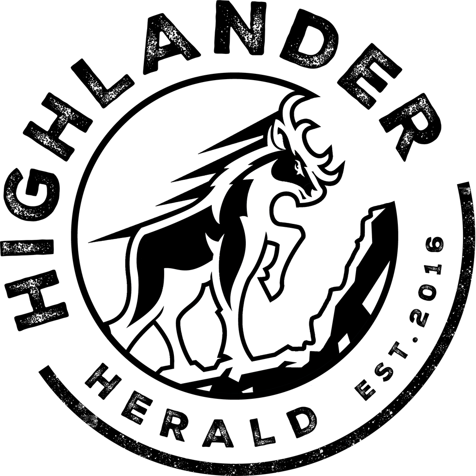


This is the current logo for the Highlander Herald. This logo was designed completely from scratch, although I was loosely inspired by a popular beverage's logo. To achieve the "worn" look, I had to use both InDesign and Photoshop to pull this off as a transparent PNG file. This replaced the 2018 logo and was one of the centerpieces of the new rebrand for the Herald .My intent was to create a logo that would stay in use past my graduation. The circular design looks a lot better as an Instagram profile image due to its circular nature. This looks significantly better for our brand image then using the "H" from the 2018 logo. We recently created seasonal logos for the holidays.
SEPTEMBER 2019

Shield Media is the umbrella name created for the company that contains the Highlander Herald and the Yearbook, which is named The Shield. Shield Media was really born out of the need for a name and logo that unifies both the newspaper and the yearbook. You'll really only see this logo on our interview forms which we give to coaches after games. I looked at several minimalist tech logos to gain inspiration and eventually reached this. The shield used is the school shield and the text intrudes on the shield to give it a modern look. This logo is most commonly presented this way, but also as a PNG with no box.
OCTOBER 2019

This design was featured on the cowbells we gave away at homecoming this year, part of the marketing plan I conceived. After sending the original Herald logo to the printer, the logo had text that was too small to print on the 1.5"x1" space on the bell. This logo may look a little blurry, but that is because it was designed to be 1.5"x1" and it has been enlarged to view on the screen. This logo contains elements of the original, like the highlander in the middle, and still uses the original font. I played around with other designs but this filled the most negative space.
bottom of page